


![]()
Here are 5 easy steps to help you see How Color Psychology Affects Mood and Emotions. You’ll learn how colors connect to feelings, how color theory shapes design, and how picking the right colors can improve branding and increase conversions.
We’ll also look at how color influences consumer behavior and marketing strategies, and at how to create color palettes that are easy to read and accessible.
You’ll discover what different colors mean in various cultures, how to set up a color hierarchy for better user experience, and how color can help boost sales.
Whether you’re working on branding or design, these tips can help you make choices that connect with people on a deeper level.
Some hyperlinks within this publication are affiliate links, and I may receive a commission from transactions conducted through them. Support for This Website is generously provided by readers like you.
Still, my opinions and recommendations are always my own and remain unbiased.
Color and visual cues play a big role in improving conversion rates.
They do more than look good. Colors and visuals guide where users look, shape how they feel, and help show what actions to take on your site.
People skim through a lot of information online quickly.
To help your page stand out, you need a clear visual hierarchy.
Using color thoughtfully is one of the easiest ways to create hierarchy and contrast.
The colors you select can significantly influence your marketing outcomes and conversion rates.
We all notice how color looks, but its effect on how people think and act is often overlooked.
Learning how colors affect people can help you boost engagement and get more conversions.
5 Easy Steps: How Color Psychology Affects Mood and Emotions
A Closer Look at Color Theory

Choosing colors that work well together is both an art and a science, and it’s a well-known part of design.
While everyone has their own tastes and backgrounds, designers and psychologists use proven methods to create color schemes that work.
User experience designer Colm Tuite uses the following framework to guide his design choices.
Shades, Tones, Pure Colors, and Tints
Pure Colors
Pure colors aren’t mixed with any other hues and are known for their bright, bold look.
They work well for brands that want to appear youthful, energetic, or cool.
Pure colors grab attention right away and leave a strong impression.
Tints
Tints are made by adding white to a color, making it softer and lighter.
Because tints feel gentle and calm, they’re popular in health, wellness, beauty, and spa brands. Tints help create a welcoming, trustworthy atmosphere.
Shades
Shades are formed by mixing black into a color, resulting in richer, more intense tones. They can evoke emotions such as danger, elegance, or mystery.
Shades add depth and can draw attention, especially when used with lighter tints or gradients.
Why Colors Matter in Branding?
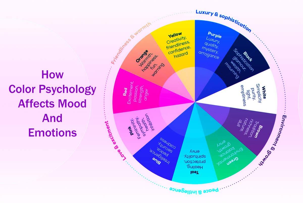
The Meanings of Colors
Colors have strong social, emotional, and cultural meanings that shape how people see your brand.
The way people connect certain colors with ideas or feelings can influence their choices and first impressions of your brand.
How We Interpret Color?

A color’s significance can differ greatly based on its tint or shade.
For example, a light sky blue feels calm and airy, while a dark navy blue suggests stability and professionalism.
Brands can build these color associations over time. For instance, pink is often linked to femininity, and deep purples or reds are common in spiritual settings.
Culture also matters. For example, green has special meaning in countries like Ireland.
These patterns are a good starting point, but always check with your audience to make sure they fit.
Context matters a lot in how people see a color.
The same color can feel elegant in one design but playful in another, depending on the fonts, layout, and images you use.
Keep Design Choices Simple
Maintaining Simplicity
One common design mistake is using too many colors.
It’s usually best to pick one main brand color and use neutral shades like white, gray, or black to keep your design balanced.
A limited color palette makes it easier for users to focus and decide what to do. Too many colors can be confusing and tiring to look at.
Why High Contrast Matters?
High contrast helps make your content easy to read and draws attention to what matters.
Using dark text on a light background, or vice versa, is a reliable way to enhance clarity and readability.
For example, black text on white is easy to see, but yellow or pale green on white can be hard to read because they’re not bright enough.
Always check how your colors look in both light and dark modes, and make sure they meet accessibility standards for contrast.
A Real-World Example of Effective Contrast

Imagine a spa owner asks your team to design a logo.
The spa aims to attract mostly women and highlight its natural, organic products, aiming for a calm, healing vibe.
Here, tints work better than dark shades or bright pure colors because they feel gentle and calming.
Soft pink, pastel yellow, lavender, and light blue all suggest peace, femininity, and relaxation.
Green is also a great choice for indicating that something is organic, as it evokes nature and freshness.
But a dark, rich green might feel too heavy or less welcoming to the audience.
A lighter green keeps the natural feel while adding a sense of calm and gentleness.
Incorporating a bit of blue can enhance the palette’s calming effect and better connect the design with the spa’s branding.
By carefully choosing colors, the spa can showcase its values and attract the right customers.
In the end, using color wisely makes your site look better and helps improve the user experience and conversions.
Conversions and Color: A Deep Dive into Color’s Impact on Consumer Behavior
Understanding Color and Its Impact on Conversions
Color plays a big role in how people shop, underscoring the importance of visual appeal in buying decisions.
Research shows that people often judge products within just a few seconds of seeing them, often without even realizing it.
During those first moments, color is one of the main factors shaping their first impression.
Studies have found that ads with bright, bold colors attract more attention and are better remembered than black-and-white ads.
Even minor adjustments to a product’s color or packaging can significantly influence sales.
For example, adding new color choices can quickly boost interest, since people are drawn to something new and fresh.
Shows that color doesn’t just catch the eye—it can also influence what people decide to buy.
The Role of Visual Appeal in Product Choice
With so many similar products out there, people often look at color and appearance before considering features or benefits.
In many cases, especially with popular products, color can be the main reason someone picks one item over another.
Using the same colors in your branding over time helps people recognize your brand and builds trust and loyalty.
But it’s important to remember that not everyone likes the same colors.
Cultural and regional backgrounds can strongly influence which colors people prefer.
For example, a color scheme that works well in North America might not have the same effect in Asian markets.
That’s why it’s important to test your color choices with your target audience to ensure they align with what people want and boost conversions.
Color is important, but it’s only one of many things that affect how people shop.
Other factors, such as good design, clear text, layout, how fast your website loads, and even scent, can also make a big difference in usability and conversions.
Just like bad writing can hurt the user experience, using the wrong colors can lower your chances of making a sale.
When improving conversion rates, keep testing and tweaking your color choices to see what works best.
Navigating Gender and Color Preferences

Older studies often discuss gender-based color preferences, but relying solely on these general ideas can lead to mistakes and miss the mark with today’s audiences.
Today’s shoppers are more diverse than ever, with many different identities and preferences that don’t fit old gender stereotypes.
For example, sticking to old color stereotypes can turn off large parts of your audience.
To really connect with your audience, focus less on outdated gender ideas and more on understanding what your customers actually want and need.
If you use color carefully, it can help your marketing reach and connect with people from many different backgrounds.
Also, research shows that color preferences related to gender often depend on the situation, and people may have more in common than you’d expect.
While older research highlighted some differences, today’s marketing focuses more on understanding and engaging your audience than on following outdated stereotypes.
Crafting a More Effective Color Strategy
Instead of treating past studies as strict rules, use them for inspiration and stay flexible.
Since today’s audiences are different from those in older studies, it’s important to talk directly with your real users.
Running real tests and using inclusive design, like A/B testing, helps you find color choices that work for different groups of people.
No matter what people like, designs with high-contrast colors and clear layouts are most helpful to most users.
As society and culture change, one color palette probably won’t please everyone, and trying to make it perfect for all can slow you down.
Instead, keep testing and adjusting your color strategy to learn what works best.
The best insights come from real user data.
By combining interviews with ongoing A/B tests, you can see how different colors affect engagement and conversions at each step of your sales process.
Prioritizing Accessibility
When designing, it’s important to focus on inclusivity. Many people have visual impairments or color vision issues.
To assist designers in creating accessible user experiences, the W3C Web Accessibility Initiative guidelines provide essential guidance.
You can use these guidelines to check contrast ratios in your designs and spot important color issues.
Brightness and Contrast Considerations
When designing, focus on meeting WCAG contrast-ratio standards rather than just how bright something looks.
Try to keep a contrast ratio of at least 4.5:1 for the main text. For bigger text, logos, or bold headers, a 3:1 ratio is usually fine.
Following these guidelines for buttons, input fields, and icons helps everyone use and navigate your site more easily.
By carefully choosing colors in your designs, you can make your site easier to use, boost conversions, and create a great experience for everyone, all while keeping accessibility in mind.
Using Color Wisely in Design

Using color thoughtfully in both light and dark themes is key to creating a balanced user experience.
A good color scheme makes your design look better and also helps users navigate and access content more easily.
Rather than relying only on color to communicate information, which may cause confusion, combine it with other visual design features.
Pairing color with clear text, helpful labels, familiar icons, or distinct patterns gives users better guidance.
When choosing colors, check your palettes in both sRGB and wide-gamut formats.
Matters because many modern screens, such as those with Display-P3, can display a wider range of colors.
Making sure your designs look good on all devices helps everyone have a smooth experience, no matter what technology they use.
Understanding Color Differences
To use color well in design, you need to understand three basics: hue, saturation, and brightness.
Although changing hue and saturation is common in branding, always focus on luminance contrast first.
Paying attention to contrast is important for both aesthetics and readability so that everyone can access your content on any background.
Trusting only your own judgment about color can be misleading.
It’s a good idea to use color-blind simulators and contrast-checking tools to review your color choices.
Also, use the latest advice from APCA and WCAG 3, along with WCAG 2.2, to keep your site accessible.
Make sure all text, icons, focus states, and form errors are easy to read even in grayscale.
Especially important for people with common color vision deficiencies such as protanopia, deuteranopia, and tritanopia.
Adding visual cues like clear outlines, underlines for links, and patterns for different statuses can make your app easier to see and use for everyone.
Adhering to Contrast Guidelines
Rules Of Thumb
Ensure all text and important graphics meet contrast standards to make your site easy to use.
Some decorative elements don’t need to follow these rules as closely, but they should never make text or important visuals hard to read.
Here are some key tips to make your website more accessible:
Readable Typography: Choose clear fonts and sizes that fit your content.
Color affects how easy your content is to read, so choose colors that complement your fonts, spacing, and layout.
Concise Content: Keep paragraphs short so users can scan them easily.
Helps users avoid feeling overwhelmed by too many colors or too much information.
Use Contrasting Colors: Pick foreground and background colors that stand out from each other but still look good together.
A color wheel can help you find good color pairs, but always check them against WCAG 2.2 contrast ratios.
Make sure important alerts, like error messages and focus states, are easy to spot, and don’t rely solely on color to convey them.
The Importance of Color in Sales
Relevance To Sales

When picking colors for web pages, forms, and calls to action (CTAs), remember that color affects how users behave. It’s not just for decoration.
Experts like Ren Walker from Adpearance note that common CTA color choices in Western markets can significantly impact sales and engagement because people respond differently to different colors.
The Psychological Impact of Color on Sales
Picking the right colors means considering your page’s purpose and how they support your goals.
Choose colors that match your audience’s expectations and the feelings you want them to have.
For example, if you’re asking for personal information in a form, calming colors like green and blue can help users feel safe and trust your site.
Also, make sure your CTA stands out from the rest of the page, with a strong contrast between the button and its text to meet accessibility standards.
Capturing Audience Attention
To find the best color for your CTAs, try A/B testing.
One good example is the “Executable Button Test” by Performable, an email marketing tool that HubSpot later bought.
They changed their CTA button from green to red on a mostly green website and saw user engagement jump by 21%.
Shows how important contrast is. Red didn’t just work better than green; it stood out from the rest of the page and helped guide users to the action you want.
Considerations for Website Elements
The colors you choose can really affect how easy it is to see and use different parts of your site. Watch out for these details:
Text Links
If links don’t have a clear color, users might not notice them.
To make links easier to see and use, give them a specific color and consider adding a background change or an underline when someone hovers over or focuses on them.
By using these color design tips, you can make your website more accessible, engaging, and effective at getting users to take action.
When you choose your colors carefully and follow accessibility rules, your site will look better and work better for everyone.
Navigation
To make navigation easier for users, use vibrant colors and make sure active states are clearly marked.
Set up a consistent color scheme that shows which page is active, so users can easily see where they are on your website or app.
Adding clear hover and focus states gives users instant feedback when they interact with navigation elements.
Clear navigation enables users to move around your site more easily, reducing frustration and improving their overall experience.
Buttons
When designing buttons, ensure primary, secondary, and tertiary actions look distinct to guide users.
Change the size, weight, and color of buttons to show which actions are most important.
For example, primary buttons can be bigger and use bold colors to highlight key actions.
Secondary buttons might be a bit smaller or use softer colors to show they’re for less urgent tasks.
A clear visual hierarchy helps users know where to focus and makes interactions smoother.
Headings
Use softer colors for headings to make your content clearer and more organized.
This approach highlights important ideas without making the page look busy.
Muted tones draw attention to key information and help keep your design consistent.
Change the weight and style of headings—like using bold for main headings and lighter styles for subheadings—to guide readers and keep your layout neat.
Items in the List
Use color to make important features or bullet points stand out.
Enhances visual appeal and guides focus to key elements.
But use color carefully—too much can make your design look messy and distract from your main message.
Add colored accents thoughtfully to help readers focus and keep your message clear.
Enhance the Personality of Your Brand
Complement Your Brand’s Personality

You can show off your brand’s personality by using color thoughtfully.
Pick colors that highlight your brand and keep things consistent everywhere you show up.
Make sure your colors match your brand’s voice and values, and help tell your story.
For example, bright colors can show creativity and energy, while softer tones can suggest professionalism and reliability.
Using color carefully helps you build a look that connects with your audience and makes your brand easy to recognize.
Suggested Steps for Marketers:
Step 1: Select the Emotions You Want to Express
Start by thinking about how you want your audience to feel when they interact with your brand.
Select a color palette that reflects these emotions. Here are some popular choices:
Monochromatic: Use different shades of a single color, such as several blues, for a calm, unified look.
Analogous: Select two or three neighboring colors on the color wheel, like green and blue, to achieve a calm and harmonious appearance.
Complementary: Use colors opposite each other on the wheel, like blue and orange, for strong contrast and visual interest.
Triadic: Select three colors evenly spaced on the color wheel to create a balanced, vibrant palette that grabs attention without being overpowering.
Step 2: Choose the Palette That Best Represents Your Business’s Style
Pick colors that reflect what your business is about and the feelings you want to share:
Warm and Cozy Browns: These colors feel comfortable and sturdy, which works well for handmade or artisanal brands.
Mix browns with soft blues or grays for a welcoming, down-to-earth vibe.
Playful Greens: Bright greens with blues and oranges are great for brands that want to show fun and energy.
This color mix works well for young or energetic audiences.
Serious Blues: Blue feels calm and trustworthy, making it a good choice for brands that need to look professional, such as financial services.
Try adding small touches of gray, brown, or muted orange, but keep extra colors to a minimum to avoid clutter.
Energetic Reds: Bright reds grab attention and create urgency, so they’re great for calls to action.
To keep things easy to read, leave plenty of white space around red elements and make sure your design has a clear order.
Step 3: Identify Your Specialty
It’s important to know what people expect in your industry so you can make smart design choices.
For example, a financial website should look stable and reliable, so avoid using colors that are too bright or unusual, as they might hurt user trust.
Rather than using bright reds and yellows like fast-food brands, try rich greens for growth, with black and gold accents for a touch of sophistication and lasting appeal.
Even in traditional fields, you can create a modern, friendly look by choosing elegant colors, using plenty of white space, and adding small interactive touches.
Makes the user experience feel more welcoming and easy to use.
Finally, don’t overlook the power of white space.
Giving your pages some breathing room helps build trust and a sense of order, which is especially helpful for industries like banking and finance, where people need to feel confident before making decisions.
Key Lessons in Color Theory: A Closer Look

Color is a broad topic that covers science, culture, and personal experience.
To work confidently with color, it helps to understand a few key basics:
1. Scientific Foundations of Color:
Science shows that color affects how we feel and think.
Knowing how different colors, tints, and shades make people feel helps you make better design choices.
For example, warm colors like red and orange are linked to energy and passion. They can make things feel exciting or urgent.
They are ideal for creating relaxing environments where one can unwind comfortably.
Learning how colors affect emotions can make your designs more effective.
2. Cultural Implications of Colors:
Colors mean different things in different cultures, which can change how people see your work.
For example, white often stands for purity and celebration in Western cultures, but in some Eastern cultures, it represents mourning.
Before sharing your designs, take time to learn about these cultural meanings.
Helps your color choices match your message and connect with your audience.
3. Individual Variations in Color Perception:
People see colors differently due to factors such as eye health, screen settings, and lighting.
As a designer, make sure your work is easy to read for everyone.
Choosing high-contrast colors makes your designs more accessible and helps everyone understand your message.
4. Considerations for Color Vision Impairments:
Remember that some people have trouble seeing certain colors, especially red and green.
To make your designs accessible to everyone, use strong contrast and add other cues besides color.
For example, adding text labels, patterns, or textures can convey important information without relying solely on color.
5. Enhancing Clarity and Conversion through Color Hierarchy:
Using color thoughtfully can guide people through your design and show what’s most important.
Good color choices can also boost conversion rates.
For example, calls to action should stand out. Picking colors that really contrast with the rest of your design helps get people’s attention and encourages them to act.
6. Data-Driven Color Choices:
Choosing a color palette should be a careful process, just like other parts of conversion rate optimization.
Use A/B testing to test different designs and see which works best, based on real results.
By looking at how users interact and what they prefer, you can adjust your colors to better connect with your audience.
7. Adherence to Industry Standards:
Creativity matters in design, but it’s also important to follow industry standards.
If you move too far from common standards, users might get confused and have a worse experience.
Learn these standards to balance new ideas with clear, easy-to-use designs.
8. Reliable Color Choices:
When you’re unsure, blue and green shades are usually safe choices in design.
These colors work well across devices and in both light and dark modes, keeping your design consistent.
Picking these reliable colors often leads to a better user experience.
9. Investing in Visual Design Integrity:
Using color consistently and thoughtfully can make your brand stronger and build trust.
Your brand’s colors should be easy to recognize and should reflect what your brand stands for.
A well-chosen color scheme helps people remember your brand and gives your visuals a unified look.
10. Deliberate Use of Color:
Using color to highlight important things like buttons and menus makes your design easier to use.
Careful color choices can boost engagement and help users focus on what matters, without making things feel too busy.
11. Memorable vs. Loud Colors:
Keep in mind that bright or loud colors don’t always make your design more memorable.
Try to pick colors that stand out but are also dependable.
This way, people will easily connect certain colors with your brand and remember it.
12. Modern Accessibility Tools and Testing:
Use modern tools such as WCAG 2.2 contrast checks, focus visibility aids, and color-blind simulators to verify that your colors meet accessibility standards.
Also, look at what others in your industry are doing and ask customers for feedback to learn more.
By continually improving, you’ll stay up to date with the best design practices.
It’s also important to keep up with new guidelines, like those from the APCA, to improve how you use color in your designs.
Keep learning about color theory so you can create designs that look great and are easy for everyone to use.
How to Write a Newsletter that People Will Easily Read: 10 Easy Steps
How to Boost Your Brand Visibility Using Public Relations: 10 Easy Steps
8 Easy Ways to Create Content That Google Wants to Rank Higher
13 Steps: How to Improve Your Online Reputation: Important?